14 | Using Clarity AirWave 8.2.3 and Clarity Beta | User Guide
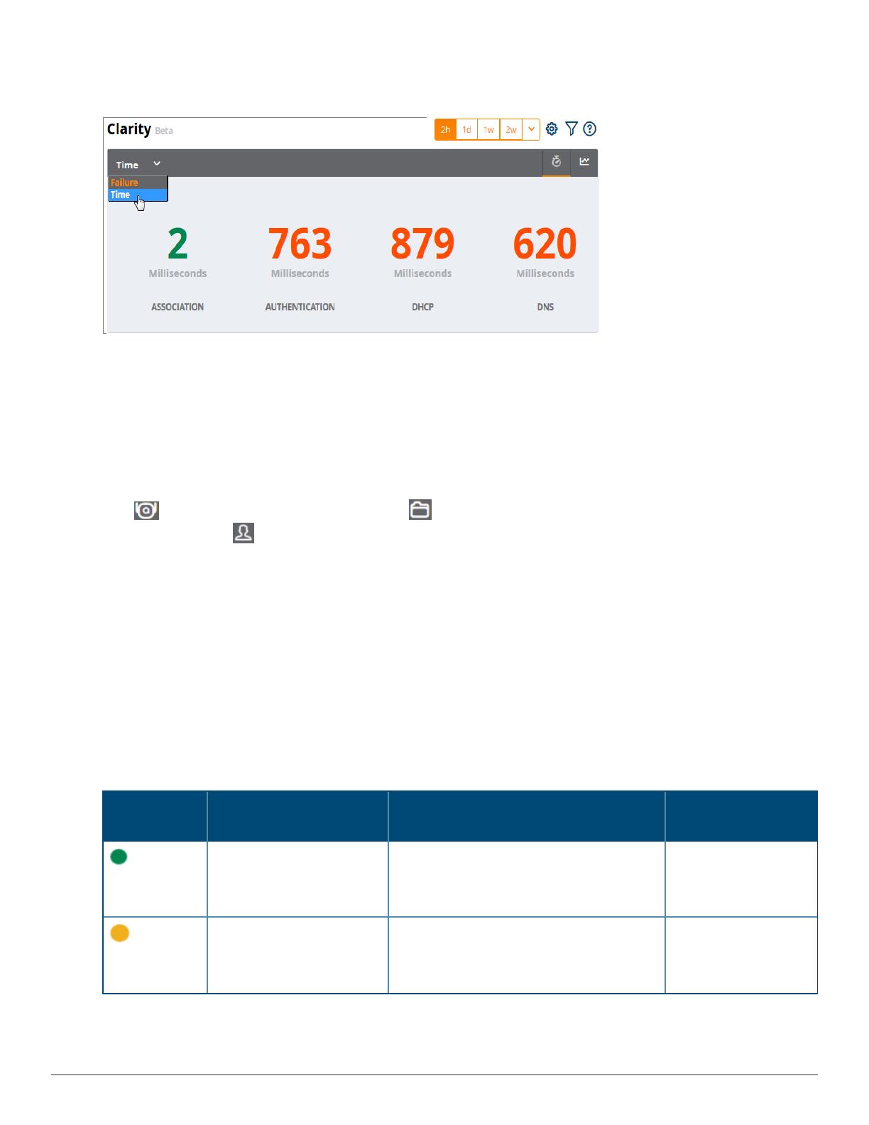
Figure 24: Home > ClarityDashboard Showing Average Process Times
First 25 Results
Clarity Live displays only 25 subfolders and APs with the lowest performance levels. If you have more than 25
subfolders or APs in the folder view, you can increase the number of results returned per page.
To see more than 25 results:
1. Click the Details link at the bottom right corner of a Clarity table. A Details pop up window appears.
2. Click the per page drop down list in the lower left corner of the window and select the number of results.
Click to view information about APs, or click to return to the default folder view. To see the top 25 users
by Clarity issue, click at the top right of the Summary table.
Thresholds for Failures and Process Times
Each icon in the Summary table represents quality thresholds for the number failures and the average amount
of time it takes the process to complete.
For example, if a process has a high failure rate but a good process time, the icon will be red, indicating the most
severe threshold crossed in either category. Hover your mouse over an icon to display the number of
authentication process failures and successes for clients associating to individual APs or folders of APs, as well as
the average time it took for each process to complete.
Refer to Table 2 for descriptions of what each icon color represents and the thresholds for process times and
failure rates.
Icon Color Description Process Time Thresholds Failure Rate
Threshold
Good failure rate and
process time
lGood Association time: <10 ms
lGood Authentication time: <500ms
lGood DHCP time: <100 ms
lGood DNS time: <100 ms
< 10% failures
Fair failure rate or process
time
lFair Association time: 10 -20 ms
lFair Authentication time: 500-1000ms
lFair DHCP time: 100 - 200ms
lFair DNS time: 100 -200ms
>10% to 20% failures
Table 2: Icon Color Codes and Thresholds


