Wiley 978-0-470-28580-0 Datasheet
- Category
- Software manuals
- Type
- Datasheet
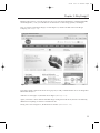
Wiley 978-0-470-28580-0 is a comprehensive guide to designing and managing SharePoint portals, providing valuable insights and practical techniques for creating effective and engaging intranets and extranets.
With this book, you'll gain a deep understanding of SharePoint's design principles, best practices, and advanced customization options. You'll learn how to leverage SharePoint's powerful features to create user-friendly interfaces, improve collaboration and communication, and integrate with other business systems.
This guide covers a wide range of topics, including:
- Planning and designing SharePoint portals


-
 1
1
-
 2
2
-
 3
3
-
 4
4
-
 5
5
-
 6
6
-
 7
7
-
 8
8
-
 9
9
-
 10
10
-
 11
11
-
 12
12


Wiley 978-0-470-28580-0 Datasheet
- Category
- Software manuals
- Type
- Datasheet
Wiley 978-0-470-28580-0 is a comprehensive guide to designing and managing SharePoint portals, providing valuable insights and practical techniques for creating effective and engaging intranets and extranets.
With this book, you'll gain a deep understanding of SharePoint's design principles, best practices, and advanced customization options. You'll learn how to leverage SharePoint's powerful features to create user-friendly interfaces, improve collaboration and communication, and integrate with other business systems.
This guide covers a wide range of topics, including:
- Planning and designing SharePoint portals
Ask a question and I''ll find the answer in the document
Finding information in a document is now easier with AI
Related papers
-
 Wiley 978-0-470-44875-5 Datasheet
-
 Wiley 978-0-470-09941-4 Datasheet
-
 Wiley 978-0-470-12448-2 Datasheet
-
 Wiley 978-0-470-42138-3 Datasheet
-
 Wiley 978-0-470-52942-3 Datasheet
-
 Wiley 978-0-470-44931-8 Datasheet
-
 Wiley 978-0-470-38644-6 Datasheet
-
 Wiley 978-0-470-64398-3 Datasheet
-
 Wiley 978-0-470-62638-2 Datasheet
-
 Wiley 978-0-470-22363-5 Datasheet


Other documents
-
 FolkArt 5105 User guide
-
 FolkArt 5068 User guide
-
Microsoft Computer Accessories 2007 User manual
-
 Wet and Forget 805048 User manual
-
Adobe RoboHelp 10.0 User guide
-
-
Mee Audio Tips For Your Audiologist Owner's manual
-
 Foxit PDF IFilter for Server 3.0 2014 User manual
-
 Foxit PDF IFilter for Server 3.11 2016 User manual
-
 Foxit PDF IFilter for Server 3.0 2013 User manual


