
Addison-Wesley Publishing Company
Reading, Massachusetts Menlo Park, California New York
Don Mills, Ontario Wokingham, England Amsterdam Bonn
Sydney Singapore Tokyo Madrid San Juan
Paris Seoul Milan Mexico City Taipei
Newton 2.0 User Interface
Guidelines

Apple Computer, Inc.
© 1996, 1994 Apple Computer, Inc.
All rights reserved.
No part of this publication may be
reproduced, stored in a retrieval
system, or transmitted, in any form
or by any means, mechanical,
electronic, photocopying, recording,
or otherwise, without prior written
permission of Apple Computer, Inc.,
except to make a backup copy of
any documentation provided on
CD-ROM. Printed in the United
States of America.
No licenses, express or implied, are
granted with respect to any of the
technology described in this book.
Apple retains all intellectual
property rights associated with the
technology described in this book.
This book is intended to assist
application developers to develop
applications only for Apple-labeled
or Apple-licensed computers.
Every effort has been made to
ensure that the information in this
manual is accurate. Apple is not
responsible for printing or clerical
errors.
Apple Computer, Inc.
1 Infinite Loop
Cupertino, CA 95014
408-996-1010
Apple, the Apple logo, APDA,
AppleLink, AppleTalk, LaserWriter,
Macintosh, and Newton are
trademarks of Apple Computer, Inc.,
registered in the United States and
other countries.
Balloon Help, Espy, Geneva, the
light bulb logo, MessagePad,
NewtonScript, Newton Toolkit, New
York, QuickDraw, and System 7 are
trademarks of Apple Computer, Inc.
Adobe Illustrator and PostScript are
trademarks of Adobe Systems
Incorporated, which may be
registered in certain jurisdictions.
FrameMaker is a registered
trademark of Frame Technology
Corporation.
Helvetica and Palatino are
registered trademarks of Linotype
Company.
ITC Zapf Dingbats is a registered
trademark of International Typeface
Corporation.
Simultaneously published in the
United States and Canada.
LIMITED WARRANTY ON MEDIA
AND REPLACEMENT
ALL IMPLIED WARRANTIES ON
THIS MANUAL, INCLUDING
IMPLIED WARRANTIES OF
MERCHANTABILITY AND FITNESS
FOR A PARTICULAR PURPOSE, ARE
LIMITED IN DURATION TO NINETY
(90) DAYS FROM THE DATE OF THE
ORIGINAL RETAIL PURCHASE OF
THIS PRODUCT.
Even though Apple has reviewed this
manual, APPLE MAKES NO
WARRANTY OR REPRESENTATION,
EITHER EXPRESS OR IMPLIED, WITH
RESPECT TO THIS MANUAL, ITS
QUALITY, ACCURACY,
MERCHANTABILITY, OR FITNESS
FOR A PARTICULAR PURPOSE. AS A
RESULT, THIS MANUAL IS SOLD “AS
IS,” AND YOU, THE PURCHASER,
ARE ASSUMING THE ENTIRE RISK
AS TO ITS QUALITY AND
ACCURACY.
IN NO EVENT WILL APPLE BE
LIABLE FOR DIRECT, INDIRECT,
SPECIAL, INCIDENTAL, OR
CONSEQUENTIAL DAMAGES
RESULTING FROM ANY DEFECT OR
INACCURACY IN THIS MANUAL,
even if advised of the possibility of such
damages.
THE WARRANTY AND REMEDIES
SET FORTH ABOVE ARE EXCLUSIVE
AND IN LIEU OF ALL OTHERS, ORAL
OR WRITTEN, EXPRESS OR IMPLIED.
No Apple dealer, agent, or employee is
authorized to make any modification,
extension, or addition to this warranty.
Some states do not allow the exclusion
or limitation of implied warranties or
liability for incidental or consequential
damages, so the above limitation or
exclusion may not apply to you. This
warranty gives you specific legal rights,
and you may also have other rights
which vary from state to state.
ISBN 0-201-48838-8
1 2 3 4 5 6 7 8 9-MA-0099989796
First Printing, May 1996
Library of Congress Cataloging-in-Publication Data
Newton 2.0 user interface guidelines / Apple Computer, Inc.
p. cm.
Includes index.
ISBN 0-201-48838-8
1. User interfaces (Computer systems) I. Apple Computer, Inc.
QA76.9.U83N49 1996
005.265—dc20 96-20168
CIP

iii
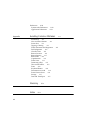
Contents
Figures xiii
Preface
About This Book
xxi
Who Should Read This Book xxi
What’s in This Book xxii
Related Books xxii
Visual Cues Used in This Book xxiii
Developer Products and Support xxiii
Chapter 1
Newton and Its Users
1-1
Understand Newton 1-1
Know Your Audience 1-2
What People Do With Newton 1-3
Accessibility 1-3
Observe Basic Human Interface Principles 1-4
Metaphors 1-4
Direct Manipulation 1-6
Feedback 1-7
See and Point 1-7
Consistency 1-7
User Control 1-8
Forgiveness 1-8
Stability 1-9
Aesthetic Integrity 1-9
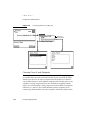
Design for the Newton System 1-10
Observe the Built-In Applications 1-10
Use the Common Pool of Data 1-10
Keep Applications Simple 1-11

iv
Use Screen Space Wisely 1-11
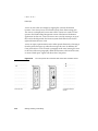
Check the Screen Size 1-11
Involve Users in the Design Process 1-13
Define Your Audience 1-13
Analyze Tasks 1-13
Build Prototypes 1-14
Observe Users 1-14
Ten Steps for Conducting a User Observation 1-15
Chapter 2
Container Views
2-1
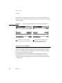
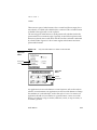
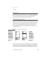
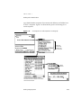
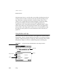
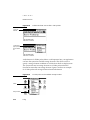
How Views Look 2-3
View Controls 2-3
View Title 2-4
View Border 2-6
Matte Border 2-6
Striped Border 2-7
Wavy Border 2-7
Plain Border 2-8
Drop Shadows 2-8
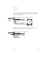
View Fill 2-9
Main Views 2-9
Title or Folder Tab 2-10
Primary Controls and Status Bar 2-11
Separator Bars 2-11
The Main View’s Border 2-13
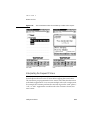
Auxiliary Views 2-14
Slips 2-15
Notification Alerts 2-17
Confirmation Alerts 2-18
Status Slips 2-20
Title and Message 2-21
Progress Indicator 2-22

v
Close, Stop, or Cancel 2-23
User Decision 2-24
Palettes 2-24
Drawers 2-26
Roll Views 2-27
How Views Work 2-28
Opening Container Views 2-28
View Display Order 2-28
The Backdrop 2-29
What Is Active 2-29
View Position 2-30
Position of a Main View 2-30
Position of Auxiliary Views 2-31
Closing a View 2-32
Closing a Main View 2-32
Closing a Slip 2-33
Closing a Drawer 2-33
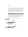
Moving a View 2-33
Changing a View’s Size 2-34
Scrolling 2-36
Scrolling With Scroll Arrows 2-37
Universal Scroll Arrows 2-38
Local Scroll Arrows 2-39
Four-way Scrolling 2-41
Automatic Scrolling 2-43
Scrolling Performance 2-44
Overview 2-44
Overview Contents 2-44
Overview Button 2-46
Switching to and from an Overview 2-47
Scroll and Overview in an Overview 2-48
Closing an Overview 2-49
Nonfunctional Scroll and Overview Controls 2-49

vi
Chapter 3
Controls
3-1
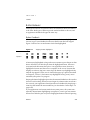
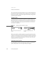
Buttons 3-2
Text Buttons 3-2
Text Button Sizes 3-3
Naming Text Buttons 3-4
Naming Take-Action Buttons 3-4
Naming Cancel- and Stop-Action Buttons 3-5
Picture Buttons 3-7
Designing Picture Buttons 3-8
Button Behavior 3-9
Button Feedback 3-9
Button States 3-10
Button Placement 3-11
Button Spacing 3-12
Large Buttons 3-14
Close Boxes 3-14
Where to Use a Regular Close Box 3-15
Where to Use a Large Close Box 3-15
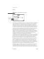
Radio Buttons 3-16
Checkboxes 3-18
Sliders 3-20
Hot Spots 3-21
Standard Newton Buttons 3-22
Analog Clock Button 3-23
Info Button 3-23
Recognizer Button 3-24
Keyboard Button 3-25
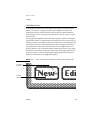
New Button 3-26
Show Button 3-26
Filing Button 3-27
Action Button 3-28
Item Info Button 3-29
Rotate Button 3-30

vii
Chapter 4
Pickers
4-1
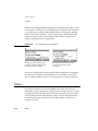
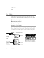
List Pickers 4-2
Elements of List Pickers 4-2
Check Marks 4-3
Icons 4-3
Item Names 4-3
Table of Items 4-4
Unavailable Items 4-5
Organization of List Pickers 4-6
Sources of List Pickers 4-7
Position of List Pickers 4-8
Using a List Picker 4-9
Picking an Item 4-9
User Editing of Pickers 4-11
Scrolling 4-12
Index Tabs 4-13
Hierarchical List Pickers 4-14
Number Picker 4-16
Date and Time Pickers 4-17
Overview Pickers 4-19
Contents of Overview Pickers 4-19
Position of Overview Pickers 4-20
Using an Overview Picker 4-21
Picking Items 4-21
Scrolling Items 4-22
Creating New Items 4-23
Standard Newton Pickers 4-23
Info Picker 4-24
New Picker 4-25
Show Picker 4-26
Action Picker 4-26
People Picker 4-27

viii
Chapter 5
Icons
5-1
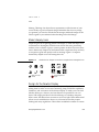
Designing Effective Icons 5-1
Thinking Up an Icon Image 5-2
Make Shapely Icons 5-3
Design for the Newton Display 5-3
Avoid Text in Icons 5-4
Make All Sizes of an Icon Look Alike 5-4
Use Icons Consistently 5-5
Think About Multicultural Compatibility 5-6
Extras Drawer Icons 5-6
Extras Drawer Icons Together 5-6
Extras Drawer Icon Size 5-8
Extras Drawer Icon Shape 5-9
Extras Drawer Icon Names 5-9
Animating an Extras Drawer Icon 5-9
Title Icons 5-11
Button Icons 5-12
Icons in a Picker 5-12
Chapter 6
Data Input
6-1
Input Fields 6-1
Tapping 6-3
Pickers 6-3
Scrolling Lists and Tables 6-4
Radio Buttons 6-6
Checkboxes 6-7
Sliders 6-7
Writing, Drawing, and Editing 6-8
Text Input 6-8
Simple Input Line 6-9
Labeled Input Line 6-10
Text Input Lines that Expand 6-11
Paragraph Input 6-12
Structured List Input 6-12

ix
Shape Input 6-13
General Input 6-14
Recognition 6-15
User Control of Recognition 6-16
Deferred Recognition 6-18
Forcing Recognition 6-19
Configuring Recognition 6-19
Editing 6-21
Selecting Text and Shapes 6-22
Erasing Text or Shapes 6-24
Joining Words 6-26
Breaking Paragraphs 6-26
Inserting Space in Text 6-26
Inserting New Text 6-27
Replacing Text 6-29
Correcting Misrecognized Text 6-29
Changing Capitalization of Text 6-31
Changing Paragraph Margins 6-31
Removing Extra Space from Paragraphs 6-31
Duplicating Text or Shapes 6-31
Changing Shapes 6-31
Moving Objects 6-32
Typing 6-32
Displaying Keyboards 6-33
Keyboard Position 6-34
Keys 6-34
Character Keys 6-34
Return 6-35
Tab 6-35
Del 6-35
Shift 6-35
Caps 6-35
Option 6-36
Arrow Keys 6-36
Type-Ahead and Auto-Repeat 6-36

x
Error Handling 6-37
Error Correction 6-37
Error Detection 6-38
Chapter 7
Routing and Communications
7-1
The In/Out Box 7-2
The In Box 7-3
The Out Box 7-4
In/Out Box Items 7-4
Viewing Items in the In/Out Box 7-5
Viewing Routing Information 7-6
Routing Outgoing Items 7-7
Action Button and Picker 7-8
An Action Button’s Location 7-9
Action Picker Contents 7-10
Building an Action Picker 7-11
Routing Slips 7-12
Sender Picker 7-13
Recipient Pickers 7-15
Choosing a Printer 7-15
Choosing Fax or E-mail Recipients 7-16
Transport Picker 7-18
Send Button and Close Box 7-18
Other Routing Slip Elements 7-20
Format Picker 7-20
Preview Button 7-23
Sending Out Box Items 7-24
Routing Incoming Items 7-24
Receiving In Box Items 7-25
Receiving Remote In Box Items 7-26
Disposing of Received Items 7-26
Putting Away Received Items 7-27
Putting Away Items Automatically 7-28
Filing Items That Are Put Away 7-28
Extending the Tag Picker 7-29

xi
Routing Status 7-29
Stopping a Send or Receive in Progress 7-31
Transport Preferences 7-32
Routing Alternatives 7-34
Routing by Intelligent Assistant 7-35
Programmed Sending 7-36
Chapter 8
Newton Services
8-1
Automatic Busy Cursor 8-2
Notify Button and Picker 8-2
Alarms 8-4
Unacknowledged Alarms 8-5
Alarm Etiquette 8-5
Sound 8-6
Find 8-6
Text Searches 8-7
Date Searches 8-8
The Scope of a Search 8-8
Customizing the Standard Find Slip 8-9
Initiating or Canceling a Search 8-11
Search Status 8-11
Search Results 8-11
Filing 8-13
Filing Button and Slip 8-14
A Filing Button’s Location 8-15
A Filing Slip’s Contents 8-16
Editing Folders 8-18
Folder Tab 8-19
Intelligent Assistant 8-22
Invoking the Assistant 8-22
Interpreting the Request Phrase 8-23
Assist Slip 8-24
Task Slips 8-27
Help 8-28

xii
Preferences 8-30
System-wide Preferences 8-30
Application Preferences 8-31
Appendix
Avoiding Common Mistakes
A-1
Info Button A-1
New and Show Buttons A-1
Screen Size A-1
Tapping v. Writing A-1
Picker Placement and Alignment A-2
Field Alignment A-2
Close Box Size A-2
Button Location A-2
Button Spacing A-2
Button Size A-3
Capitalization A-3
Picker Icons A-3
Dismissing a Slip A-3
Take-Action Button A-3
Fonts A-4
Keyboard Button A-4
Punctuation to Avoid A-4
Extras Drawer Icons A-4
Storage A-5
Date and Time Input A-5
Glossary
GL-1
Index
IN-1

xiii
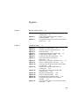
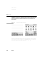
Figures
Chapter 1
Newton and Its Users
1-1
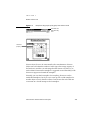
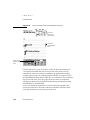
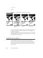
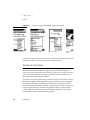
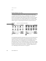
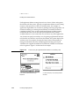
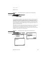
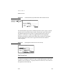
Figure 1-1
Metaphors help people quickly grasp how
software works 1-5
Figure 1-2
Users should feel they are directly controlling
something tangible 1-6
Figure 1-3
An application adjusts its size, position, and layout to
fit the screen 1-12
Chapter 2
Container Views
2-1
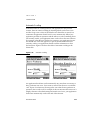
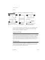
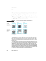
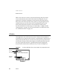
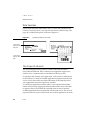
Figure 2-1
Examples of container views 2-2
Figure 2-2
Standard controls for manipulating views 2-4
Figure 2-3
Various title styles 2-5
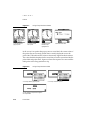
Figure 2-4
A matte border indicates a movable view 2-6
Figure 2-5
A striped border suggests routing 2-7
Figure 2-6
An alert box has a thick wavy border 2-8
Figure 2-7
Some views need the simplicity of a
plain border 2-8
Figure 2-8
Sparing use of some types of shadows is OK 2-9
Figure 2-9
A title or a folder tab tops a main view 2-10
Figure 2-10
A status bar anchors primary controls at the bottom
of a main view 2-11
Figure 2-11
Separator bars separate multiple items in a
scrolling view 2-12
Figure 2-12
Main views have matte or plain borders with
rounded corners 2-13
Figure 2-13
Examples of auxiliary views 2-14
Figure 2-14
Users can move most slips 2-15
Figure 2-15
Dismissing slips that complete actions 2-16
Figure 2-16
A notification alert tells the user something
important 2-17
Figure 2-17
A Snooze button enables a user to dismiss an alert
temporarily 2-18

xiv
Figure 2-18
A confirmation alert tells the user about a grave
situation 2-19
Figure 2-19
A status slip reports on a lengthy operation 2-20
Figure 2-20
A sequence of status messages traces the steps
of an operation 2-22
Figure 2-21
A gauge in a status slip measures elapsing
progress 2-23
Figure 2-22
A status slip can report a condition that demands
a user decision 2-24
Figure 2-23
A palette provides handy access to useful
settings 2-25
Figure 2-24
A drawer slides open and closed 2-26
Figure 2-25
Where to position a small auxiliary view 2-31
Figure 2-26
Dragging a view’s drag handle moves
the view 2-34
Figure 2-27
Dynamically adjust a view’s position, size, and layout
to fit the screen 2-35
Figure 2-28
A view may change size in response to user
actions 2-35
Figure 2-29
Ready to scroll Notepad notes into view from
above or below 2-36
Figure 2-30
Scrolling by tapping a down arrow 2-37
Figure 2-31
The universal scroll arrows at the bottom of a
MessagePad screen 2-39
Figure 2-32
How scroll arrows work in the Date Book’s
Day view 2-40
Figure 2-33
Scroll arrow color may indicate what scrolling
will reveal 2-41
Figure 2-34
A control for scrolling in four directions 2-42
Figure 2-35
An alternate control for scrolling in four
directions 2-42
Figure 2-36
Automatic scrolling 2-43
Figure 2-37
How an overview relates to a detail view 2-45
Figure 2-38
The Overview button at the bottom of a
MessagePad screen 2-46
Figure 2-39
Getting an overview 2-47

xv
Chapter 3
Controls
3-1
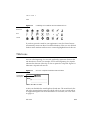
Figure 3-1
Tapping a button initiates an action 3-2
Figure 3-2
A text button’s name states what the
button does 3-2
Figure 3-3
Leave standard margins between a button’s name and
its borders 3-3
Figure 3-4
Name buttons distinctively wherever possible 3-5
Figure 3-5
Where to use a button named Cancel 3-6
Figure 3-6
A Stop button lets a user halt an operation 3-6
Figure 3-7
A picture button depicts what the button does 3-7
Figure 3-8
Where to use borders with small, self-bordered
picture buttons 3-8
Figure 3-9
Tapping a button highlights it 3-9
Figure 3-10
A button disappears when it isn’t available 3-10
Figure 3-11
Where to put buttons in a view 3-12
Figure 3-12
Group buttons by function 3-12
Figure 3-13
Regular spacing between buttons on a
MessagePad 3-13
Figure 3-14
A Close box compared to a large Close box 3-14
Figure 3-15
Where to use a regular Close box 3-15
Figure 3-16
Where to use a large Close box 3-16
Figure 3-17
Only one radio button in a cluster can
be selected 3-17
Figure 3-18
Each checkbox can be on or off 3-19
Figure 3-19
One checkbox vs. two radio buttons 3-20
Figure 3-20
A slider used for data input 3-21
Figure 3-21
Providing feedback for small, transparent
hot spots 3-22
Figure 3-22
How the Analog Clock button works 3-23
Figure 3-23
Where an Info button goes 3-24
Figure 3-24
Where a Recognizer button goes 3-24
Figure 3-25
The Recognizer button indicates the type of
recognition in effect 3-24
Figure 3-26
Where a Keyboard buttons goes 3-25
Figure 3-27
Where a New button goes 3-26
Figure 3-28
Where a Show button goes 3-26
Figure 3-29
Where a Filing button goes 3-27
Figure 3-30
A Filing button reports where a data item
is stored 3-28

xvi
Figure 3-31
Where an Action button goes 3-29
Figure 3-32
Seeing an Item Info slip 3-30
Figure 3-33
A Rotate button lets users change the screen
orientation 3-31
Chapter 4
Pickers
4-1
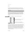
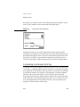
Figure 4-1 The parts of list pickers 4-2
Figure 4-2 A list picker can contain a two-dimensional table
of items 4-5
Figure 4-3 Remove unavailable items from a list picker 4-5
Figure 4-4 Grouping items in list pickers 4-7
Figure 4-5 Pickers can pop up from buttons, labels, and
hot spots 4-8
Figure 4-6 How a list picker should align with its label
or button 4-9
Figure 4-7 Using a list picker from a button 4-10
Figure 4-8 Using a list picker from a label 4-10
Figure 4-9 List pickers that are too long to display all at once
have scroll arrows 4-12
Figure 4-10 A lengthy picker can include scroll arrows and
index tabs 4-13
Figure 4-11 How a two-level hierarchy of list pickers works 4-15
Figure 4-12 A number picker simplifies specifying a numerical
value 4-16
Figure 4-13 Time pickers specify a time, a time range, or a
time offset 4-17
Figure 4-14 Date pickers specify one date or a date range 4-18
Figure 4-15 The parts of overview pickers 4-20
Figure 4-16 Entering a new value in an overview picker 4-22
Figure 4-17 An Info picker lists information items 4-24
Figure 4-18 The New picker lists types of data items that users
can create 4-25
Figure 4-19 The Show picker lists alternate ways to see an
application’s data 4-26
Figure 4-20 The Action picker lists commands for acting
on data 4-27
Figure 4-21 A People picker excerpts items from the Names File
and Owner Info applications 4-28

xvii
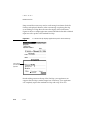
Chapter 5 Icons 5-1
Figure 5-1 Distinctive icon shapes are easier to recognize than
rectangular icons 5-3
Figure 5-2 Avoid text in icons 5-4
Figure 5-3 Small icon resembles large icon 5-5
Figure 5-4 Use icon elements consistently 5-5
Figure 5-5 The good, the bad, and the ugly in Extras
Drawer icons 5-7
Figure 5-6 Large icons crowd the Extras Drawer 5-8
Figure 5-7 An icon’s mask either highlights or animates
the icon 5-10
Figure 5-8 Combining an icon with its mask to animate
the icon 5-11
Figure 5-9 An icon in a slip title should decorate
and inform 5-11
Figure 5-10 An icon can label a button 5-12
Figure 5-11 Icons can help communicate picker item
functions 5-13
Chapter 6 Data Input 6-1
Figure 6-1 Users enter and edit data in input fields 6-2
Figure 6-2 How a picker works for data input 6-4
Figure 6-3 Data input using scrolling lists with or without
checkboxes 6-5
Figure 6-4 With radio buttons, a user can select one value
for a field 6-6
Figure 6-5 With checkboxes, a user can select more than one
value for a field 6-7
Figure 6-6 A slider used for data input 6-7
Figure 6-7 How an unlabeled text-input line works 6-9
Figure 6-8 How labeled text input lines work 6-10
Figure 6-9 How expandos work 6-11
Figure 6-10 Interface element for multiple-line or paragraph
text input 6-12
Figure 6-11 A user can rearrange a structured list by dragging
topic markers 6-13
Figure 6-12 Interface element for shape input 6-14
Figure 6-13 Interface element for general input 6-15

xviii
Figure 6-14 The Recognizer button and picker give users control
over recognition 6-16
Figure 6-15 Users may need to control recognition separately
in a slip 6-17
Figure 6-16 In an Alpha Sorter picker, users select a sort key
for ink text 6-19
Figure 6-17 Selecting words and shapes 6-23
Figure 6-18 Orientations of the scrubbing gesture 6-24
Figure 6-19 Scrubbing a little or a lot 6-25
Figure 6-20 Joining two words 6-26
Figure 6-21 Breaking a paragraph into two paragraphs 6-26
Figure 6-22 Inserting space in text 6-27
Figure 6-23 A caret marks the text insertion point 6-27
Figure 6-24 The Caret picker lists 14 hard-to-write characters and
three actions 6-28
Figure 6-25 How a Correction picker works 6-29
Figure 6-26 How a Corrector view works 6-30
Figure 6-27 The four built-in keyboards 6-32
Figure 6-28 A Keyboard picker lists alternate on-screen
keyboards 6-33
Figure 6-29 A keyboard can be embedded in a data-
input slip 6-34
Chapter 7 Routing and Communications 7-1
Figure 7-1 The In/Out Box application displays either the In Box
or the Out Box 7-3
Table 7-1 Meanings of status words in the In/Out Box
headers 7-5
Figure 7-2 A Show button provides access to alternative
views 7-6
Figure 7-3 Viewing routing information in an Item Info slip 7-7
Figure 7-4 An Action picker lists the transports available
for sending 7-8
Figure 7-5 An Action button at the bottom of a view affects the
entire view 7-9
Figure 7-6 An Action button above an item affects only
that item 7-10
Figure 7-7 An Action picker can include two kinds
of actions 7-11

xix
Figure 7-8 A routing slip shows sender, recipient, and type
of transport 7-13
Figure 7-9 Changing the sender’s name or location 7-14
Figure 7-10 Choosing a printer in a routing slip 7-16
Figure 7-11 Choosing fax or e-mail recipients in a
routing slip 7-17
Figure 7-12 Switching to another transport in a group 7-18
Figure 7-13 Setting format and content options in a
routing slip 7-20
Figure 7-14 Format choices vary by transport and class
of data 7-21
Figure 7-15 A format can get supplemental information in
an auxiliary view 7-22
Figure 7-16 Previewing outgoing page images 7-23
Figure 7-17 The Out Box’s Send picker lets users send items to
output devices 7-24
Figure 7-18 The Receive picker lists the transports available
for receiving 7-25
Figure 7-19 Connection setup varies by transport 7-26
Figure 7-20 The Tag picker disposes of currently selected
In Box items 7-27
Figure 7-21 Status slips apprise users of lengthy transport
activities 7-30
Figure 7-22 Accessing transport preferences from the In/Out Box’s
Info picker 7-32
Figure 7-23 Some common preference items for
transports 7-33
Figure 7-24 A Call routing slip sets up an outgoing
phone call 7-34
Figure 7-25 Routing with the Intelligent Assistant 7-35
Chapter 8 Newton Services 8-1
Figure 8-1 A busy cursor indicates the system is temporarily
engaged 8-2
Figure 8-2 The Notify button signals an ongoing action or
deferred alert 8-3
Figure 8-3 The Notify picker lists ongoing actions and
deferred alerts 8-3
Figure 8-4 An alarm notification alert’s Snooze button can
postpone the alarm 8-4

xx
Figure 8-5 A standard Find slip specifies what to find and where
to look 8-7
Figure 8-6 Specifying text or date searches in a Find slip 8-7
Figure 8-7 Specifying a date in a Find slip 8-8
Figure 8-8 Searching specified applications 8-9
Figure 8-9 A custom Find slip displays application-specific
criteria at the top 8-10
Figure 8-10 A status slip shows the progress of a Find
operation 8-11
Figure 8-11 A Find overview lists items that match search
criteria 8-12
Figure 8-12 The Find slip reports which found item is currently
displayed 8-13
Figure 8-13 A Filing slip names available folders and storage
locations 8-14
Figure 8-14 A Filing button at the bottom of a view affects the
entire view 8-15
Figure 8-15 A Filing button above an item affects only
that item 8-16
Figure 8-16 A Filing slip can include storage locations, folders,
or both 8-17
Table 8-1 Headings for radio button clusters in
Filing slips 8-18
Figure 8-17 Slips for entering and editing folder names 8-19
Figure 8-18 A folder tab allows users to filter a view
by folder 8-20
Figure 8-19 A Folder picker can list available storage
locations 8-20
Figure 8-20 A folder tab can include a digital clock and
calendar 8-21
Figure 8-21 A folder tab can include a view title 8-21
Figure 8-22 The Assist button makes the Assistant try a written
action request 8-23
Figure 8-23 An Assist slip appears when the Assistant needs
more information 8-25
Figure 8-24 The Assistant’s Please picker lists known actions and
recent phrases 8-26
Figure 8-25 Online help has a topical outline and concise
instructions 8-28
Figure 8-26 The Prefs application shows system-wide
preference settings 8-30
Figure 8-27 A preferences slip contains application-specific
settings 8-31
Page is loading ...
Page is loading ...
Page is loading ...
Page is loading ...
Page is loading ...
Page is loading ...
Page is loading ...
Page is loading ...
Page is loading ...
Page is loading ...
Page is loading ...
Page is loading ...
Page is loading ...
Page is loading ...
Page is loading ...
Page is loading ...
Page is loading ...
Page is loading ...
Page is loading ...
Page is loading ...
Page is loading ...
Page is loading ...
Page is loading ...
Page is loading ...
Page is loading ...
Page is loading ...
Page is loading ...
Page is loading ...
Page is loading ...
Page is loading ...
Page is loading ...
Page is loading ...
Page is loading ...
Page is loading ...
Page is loading ...
Page is loading ...
Page is loading ...
Page is loading ...
Page is loading ...
Page is loading ...
Page is loading ...
Page is loading ...
Page is loading ...
Page is loading ...
Page is loading ...
Page is loading ...
Page is loading ...
Page is loading ...
Page is loading ...
Page is loading ...
Page is loading ...
Page is loading ...
Page is loading ...
Page is loading ...
Page is loading ...
Page is loading ...
Page is loading ...
Page is loading ...
Page is loading ...
Page is loading ...
Page is loading ...
Page is loading ...
Page is loading ...
Page is loading ...
Page is loading ...
Page is loading ...
Page is loading ...
Page is loading ...
Page is loading ...
Page is loading ...
Page is loading ...
Page is loading ...
Page is loading ...
Page is loading ...
Page is loading ...
Page is loading ...
Page is loading ...
Page is loading ...
Page is loading ...
Page is loading ...
Page is loading ...
Page is loading ...
Page is loading ...
Page is loading ...
Page is loading ...
Page is loading ...
Page is loading ...
Page is loading ...
Page is loading ...
Page is loading ...
Page is loading ...
Page is loading ...
Page is loading ...
Page is loading ...
Page is loading ...
Page is loading ...
Page is loading ...
Page is loading ...
Page is loading ...
Page is loading ...
Page is loading ...
Page is loading ...
Page is loading ...
Page is loading ...
Page is loading ...
Page is loading ...
Page is loading ...
Page is loading ...
Page is loading ...
Page is loading ...
Page is loading ...
Page is loading ...
Page is loading ...
Page is loading ...
Page is loading ...
Page is loading ...
Page is loading ...
Page is loading ...
Page is loading ...
Page is loading ...
Page is loading ...
Page is loading ...
Page is loading ...
Page is loading ...
Page is loading ...
Page is loading ...
Page is loading ...
Page is loading ...
Page is loading ...
Page is loading ...
Page is loading ...
Page is loading ...
Page is loading ...
Page is loading ...
Page is loading ...
Page is loading ...
Page is loading ...
Page is loading ...
Page is loading ...
Page is loading ...
Page is loading ...
Page is loading ...
Page is loading ...
Page is loading ...
Page is loading ...
Page is loading ...
Page is loading ...
Page is loading ...
Page is loading ...
Page is loading ...
Page is loading ...
Page is loading ...
Page is loading ...
Page is loading ...
Page is loading ...
Page is loading ...
Page is loading ...
Page is loading ...
Page is loading ...
Page is loading ...
Page is loading ...
Page is loading ...
Page is loading ...
Page is loading ...
Page is loading ...
Page is loading ...
Page is loading ...
Page is loading ...
Page is loading ...
Page is loading ...
Page is loading ...
Page is loading ...
Page is loading ...
Page is loading ...
Page is loading ...
Page is loading ...
Page is loading ...
Page is loading ...
Page is loading ...
Page is loading ...
Page is loading ...
Page is loading ...
Page is loading ...
Page is loading ...
Page is loading ...
Page is loading ...
Page is loading ...
Page is loading ...
Page is loading ...
Page is loading ...
Page is loading ...
Page is loading ...
Page is loading ...
Page is loading ...
Page is loading ...
Page is loading ...
Page is loading ...
Page is loading ...
Page is loading ...
Page is loading ...
Page is loading ...
Page is loading ...
Page is loading ...
Page is loading ...
Page is loading ...
Page is loading ...
Page is loading ...
Page is loading ...
Page is loading ...
Page is loading ...
Page is loading ...
Page is loading ...
Page is loading ...
Page is loading ...
Page is loading ...
Page is loading ...
Page is loading ...
Page is loading ...
Page is loading ...
Page is loading ...
Page is loading ...
Page is loading ...
Page is loading ...
Page is loading ...
Page is loading ...
Page is loading ...
Page is loading ...
Page is loading ...
Page is loading ...
Page is loading ...
Page is loading ...
Page is loading ...
Page is loading ...
Page is loading ...
Page is loading ...
Page is loading ...
Page is loading ...
Page is loading ...
Page is loading ...
Page is loading ...
Page is loading ...
Page is loading ...
Page is loading ...
Page is loading ...
Page is loading ...
Page is loading ...
Page is loading ...
Page is loading ...
Page is loading ...
Page is loading ...
Page is loading ...
Page is loading ...
Page is loading ...
Page is loading ...
Page is loading ...
Page is loading ...
Page is loading ...
Page is loading ...
Page is loading ...
Page is loading ...
Page is loading ...
Page is loading ...
Page is loading ...
Page is loading ...
Page is loading ...
Page is loading ...
Page is loading ...
Page is loading ...
Page is loading ...
Page is loading ...
Page is loading ...
Page is loading ...
Page is loading ...
Page is loading ...
Page is loading ...
Page is loading ...
Page is loading ...
Page is loading ...
Page is loading ...
Page is loading ...
Page is loading ...
Page is loading ...
Page is loading ...
Page is loading ...
Page is loading ...
Page is loading ...
Page is loading ...
-
 1
1
-
 2
2
-
 3
3
-
 4
4
-
 5
5
-
 6
6
-
 7
7
-
 8
8
-
 9
9
-
 10
10
-
 11
11
-
 12
12
-
 13
13
-
 14
14
-
 15
15
-
 16
16
-
 17
17
-
 18
18
-
 19
19
-
 20
20
-
 21
21
-
 22
22
-
 23
23
-
 24
24
-
 25
25
-
 26
26
-
 27
27
-
 28
28
-
 29
29
-
 30
30
-
 31
31
-
 32
32
-
 33
33
-
 34
34
-
 35
35
-
 36
36
-
 37
37
-
 38
38
-
 39
39
-
 40
40
-
 41
41
-
 42
42
-
 43
43
-
 44
44
-
 45
45
-
 46
46
-
 47
47
-
 48
48
-
 49
49
-
 50
50
-
 51
51
-
 52
52
-
 53
53
-
 54
54
-
 55
55
-
 56
56
-
 57
57
-
 58
58
-
 59
59
-
 60
60
-
 61
61
-
 62
62
-
 63
63
-
 64
64
-
 65
65
-
 66
66
-
 67
67
-
 68
68
-
 69
69
-
 70
70
-
 71
71
-
 72
72
-
 73
73
-
 74
74
-
 75
75
-
 76
76
-
 77
77
-
 78
78
-
 79
79
-
 80
80
-
 81
81
-
 82
82
-
 83
83
-
 84
84
-
 85
85
-
 86
86
-
 87
87
-
 88
88
-
 89
89
-
 90
90
-
 91
91
-
 92
92
-
 93
93
-
 94
94
-
 95
95
-
 96
96
-
 97
97
-
 98
98
-
 99
99
-
 100
100
-
 101
101
-
 102
102
-
 103
103
-
 104
104
-
 105
105
-
 106
106
-
 107
107
-
 108
108
-
 109
109
-
 110
110
-
 111
111
-
 112
112
-
 113
113
-
 114
114
-
 115
115
-
 116
116
-
 117
117
-
 118
118
-
 119
119
-
 120
120
-
 121
121
-
 122
122
-
 123
123
-
 124
124
-
 125
125
-
 126
126
-
 127
127
-
 128
128
-
 129
129
-
 130
130
-
 131
131
-
 132
132
-
 133
133
-
 134
134
-
 135
135
-
 136
136
-
 137
137
-
 138
138
-
 139
139
-
 140
140
-
 141
141
-
 142
142
-
 143
143
-
 144
144
-
 145
145
-
 146
146
-
 147
147
-
 148
148
-
 149
149
-
 150
150
-
 151
151
-
 152
152
-
 153
153
-
 154
154
-
 155
155
-
 156
156
-
 157
157
-
 158
158
-
 159
159
-
 160
160
-
 161
161
-
 162
162
-
 163
163
-
 164
164
-
 165
165
-
 166
166
-
 167
167
-
 168
168
-
 169
169
-
 170
170
-
 171
171
-
 172
172
-
 173
173
-
 174
174
-
 175
175
-
 176
176
-
 177
177
-
 178
178
-
 179
179
-
 180
180
-
 181
181
-
 182
182
-
 183
183
-
 184
184
-
 185
185
-
 186
186
-
 187
187
-
 188
188
-
 189
189
-
 190
190
-
 191
191
-
 192
192
-
 193
193
-
 194
194
-
 195
195
-
 196
196
-
 197
197
-
 198
198
-
 199
199
-
 200
200
-
 201
201
-
 202
202
-
 203
203
-
 204
204
-
 205
205
-
 206
206
-
 207
207
-
 208
208
-
 209
209
-
 210
210
-
 211
211
-
 212
212
-
 213
213
-
 214
214
-
 215
215
-
 216
216
-
 217
217
-
 218
218
-
 219
219
-
 220
220
-
 221
221
-
 222
222
-
 223
223
-
 224
224
-
 225
225
-
 226
226
-
 227
227
-
 228
228
-
 229
229
-
 230
230
-
 231
231
-
 232
232
-
 233
233
-
 234
234
-
 235
235
-
 236
236
-
 237
237
-
 238
238
-
 239
239
-
 240
240
-
 241
241
-
 242
242
-
 243
243
-
 244
244
-
 245
245
-
 246
246
-
 247
247
-
 248
248
-
 249
249
-
 250
250
-
 251
251
-
 252
252
-
 253
253
-
 254
254
-
 255
255
-
 256
256
-
 257
257
-
 258
258
-
 259
259
-
 260
260
-
 261
261
-
 262
262
-
 263
263
-
 264
264
-
 265
265
-
 266
266
-
 267
267
-
 268
268
-
 269
269
-
 270
270
-
 271
271
-
 272
272
-
 273
273
-
 274
274
-
 275
275
-
 276
276
-
 277
277
-
 278
278
-
 279
279
-
 280
280
-
 281
281
-
 282
282
-
 283
283
-
 284
284
-
 285
285
-
 286
286
-
 287
287
-
 288
288
-
 289
289
-
 290
290
-
 291
291
-
 292
292
-
 293
293
-
 294
294
-
 295
295
-
 296
296
-
 297
297
-
 298
298
-
 299
299
-
 300
300
-
 301
301
-
 302
302
-
 303
303
-
 304
304
-
 305
305
-
 306
306
-
 307
307


Ask a question and I''ll find the answer in the document
Finding information in a document is now easier with AI
Other documents
-
 ESDDI 8595756441 User manual
-
LENRICH LBK224-1 User guide
-
 FSC A320 SIDESTICK PRO OEM Instructor User Manual
-
Vicon VAX Door Controllers User manual
-
Dell PowerVault 136T LTO/SDLT (Tape Library) User guide
-
MAGIX Xara 3D Maker 7.0 User manual
-
Quantum Scalar 100 User guide
-
 CROWN VERITY ZZ 500 201 User manual
-
-
SMC Networks M8501 User manual


